Website Concept for Rio Tinto's Kennecott Copper Mine
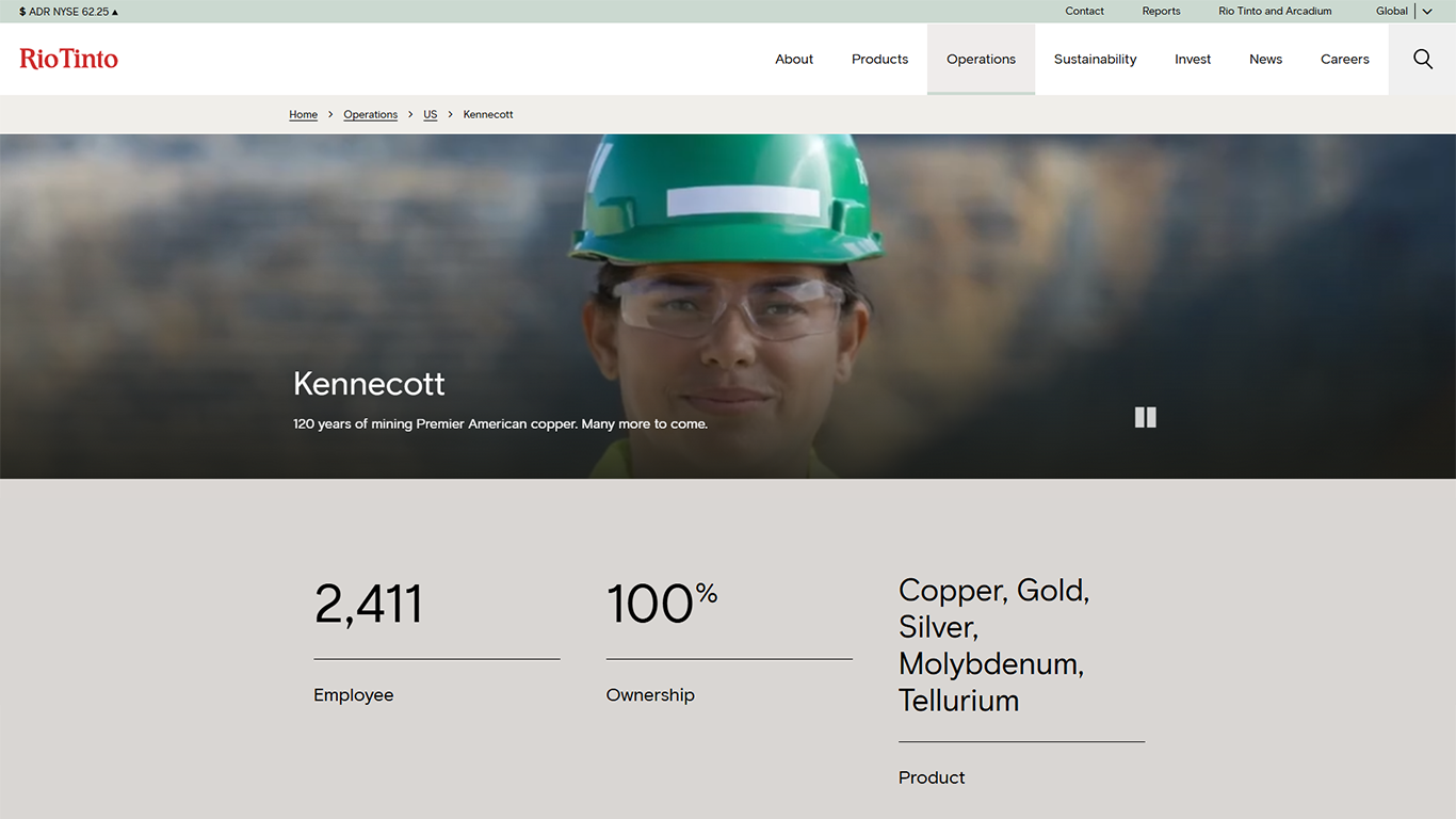
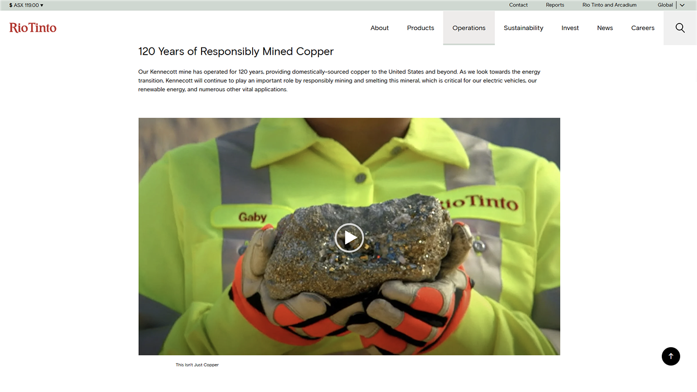
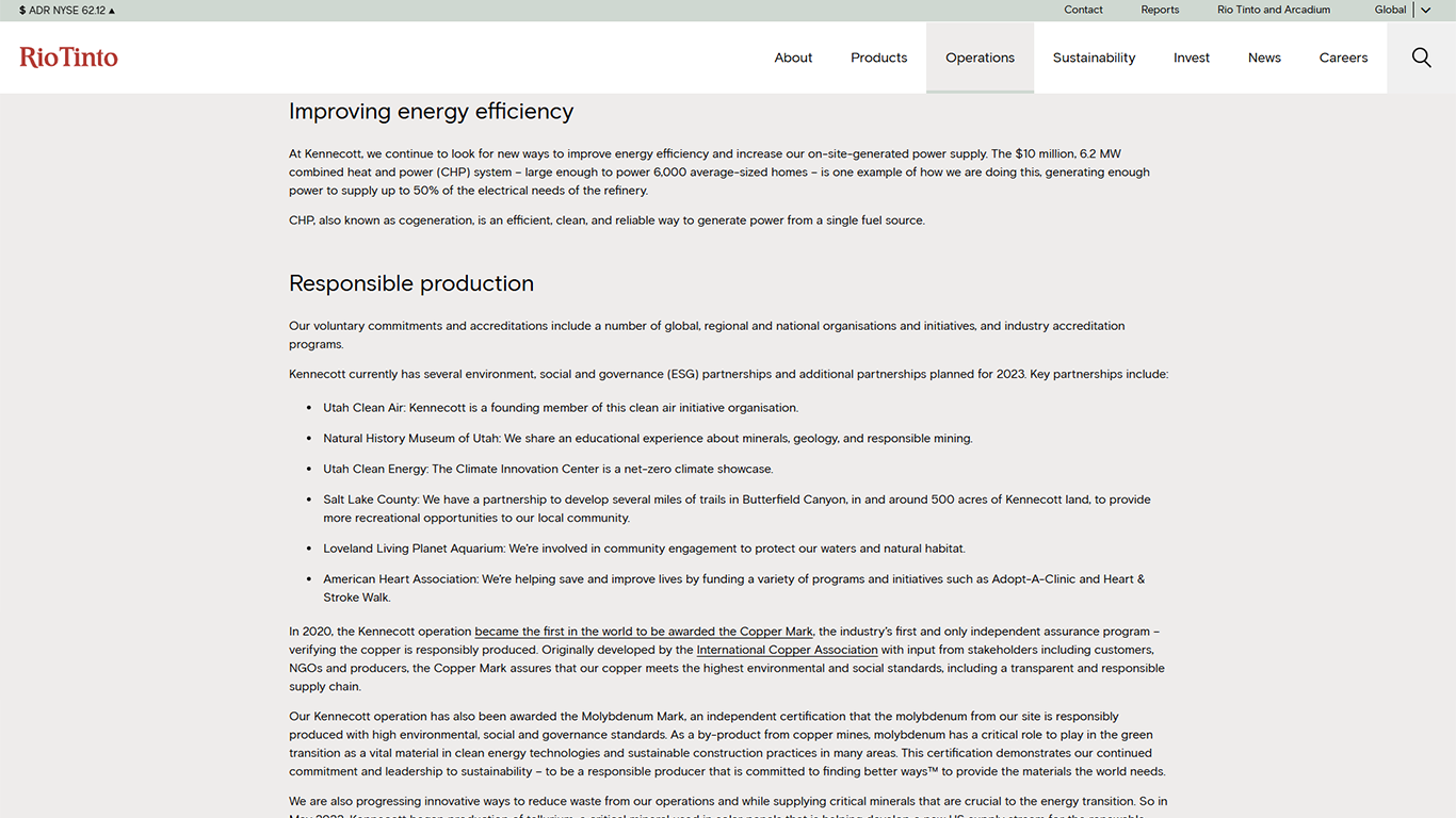
Current Website
My Concept
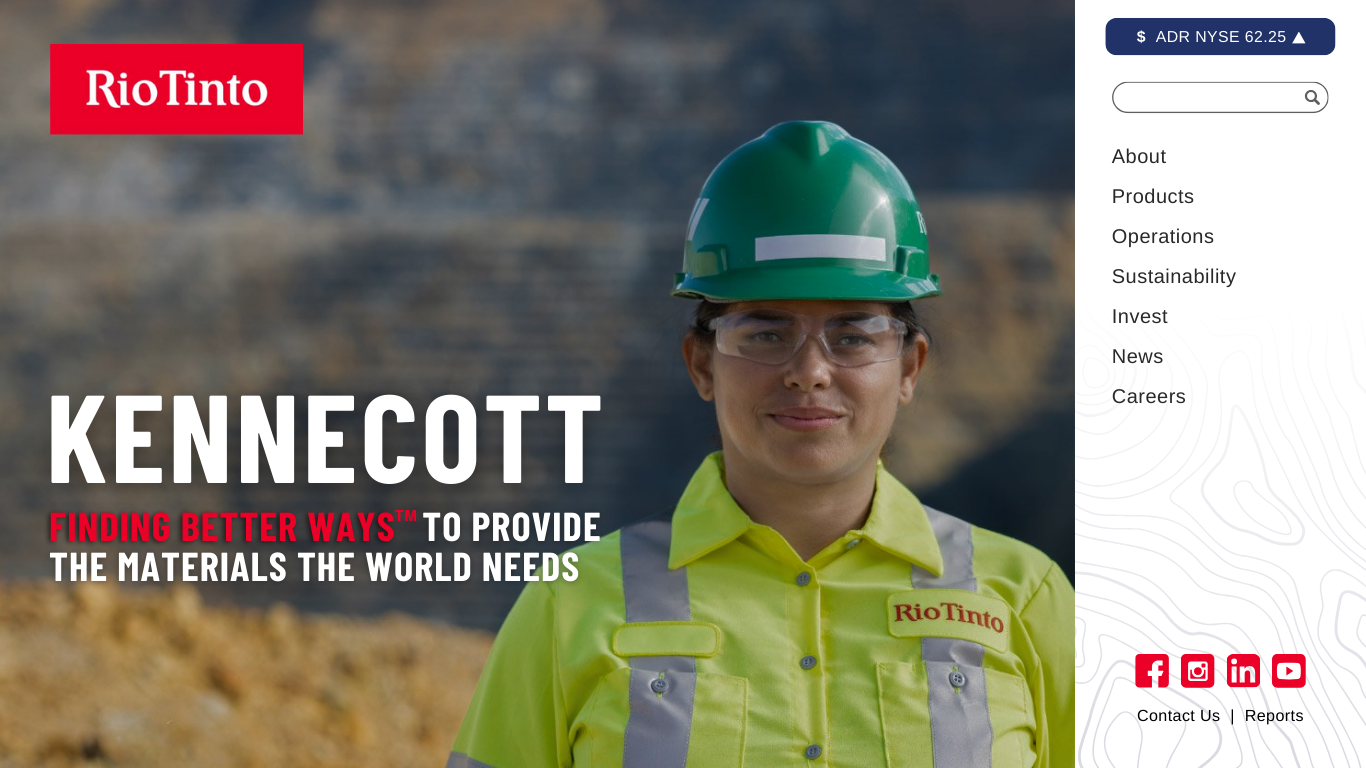
About My Changes
- Made the website inviting, breathable, and more colorful from the outset by enlarging the photo of the Kennecott employee in the hero section.
- Substituted the olive-green/gray/white color palette with white/blue/red, with red matching the hue of the Rio Tinto logo.
- Substituted the current text overlapping the photo with Rio Tinto's slogan to immediately convey a positive message about the company's mission.
- Used larger and bolder text throughout the website to make the information easier to read and the message more impactful.
- Used "you" language to connect with the audience and communicate why and how Kennecott effects them.
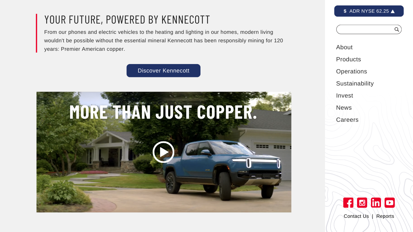
- In the "Your Future, Powered by Kennecott" section, I changed the thumbnail in the embedded video so the image compliments the content in the paragraph overhead.
- On the current website, the links to Rio Tinto's social media are at the bottom of the page, accessible only after quite a bit of scrolling due to the amount of continuous content. Here, the social media links are accessible from the outset and appear in the menu, which remains fixed as the audience scrolls.
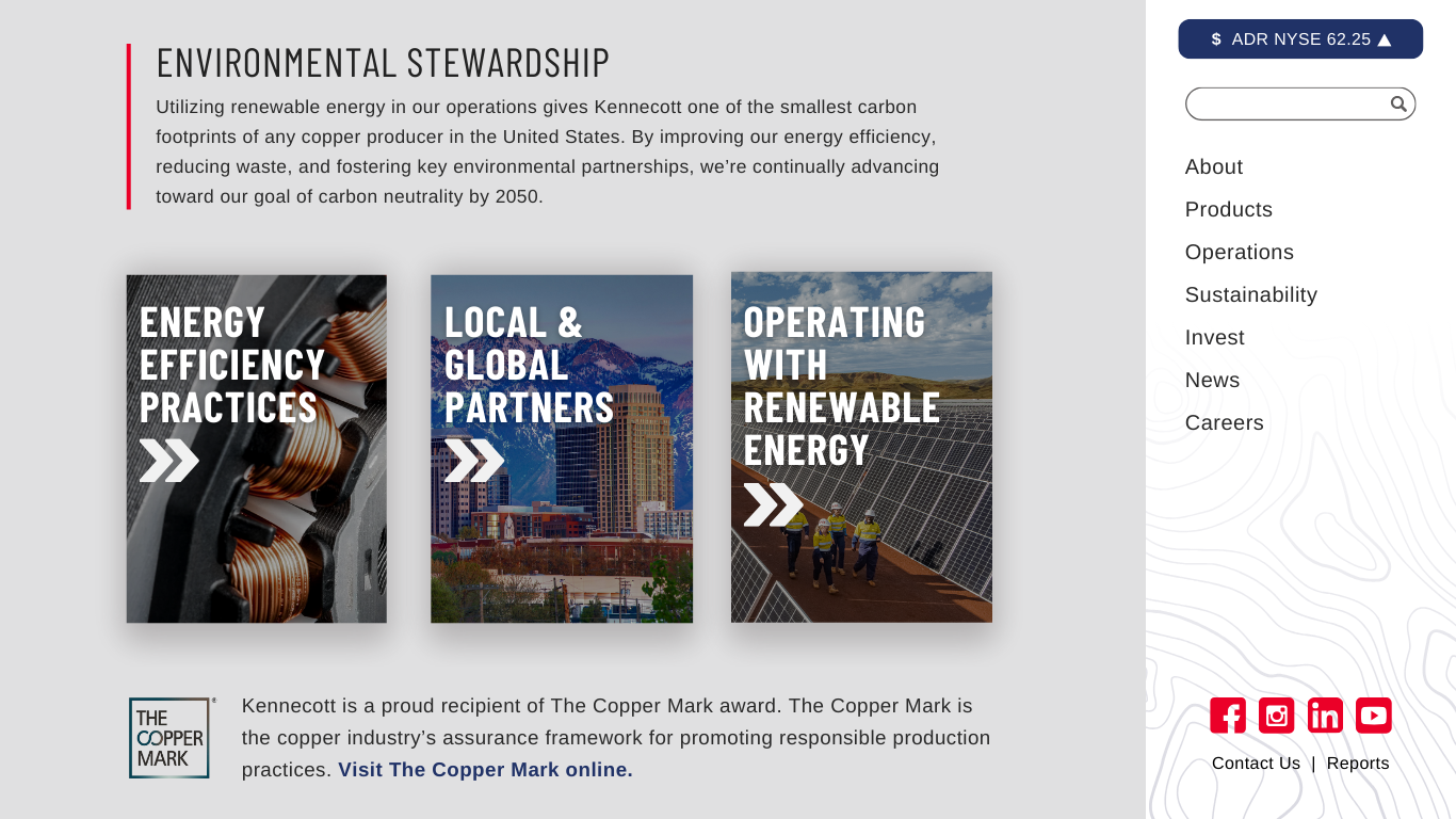
- The current website has a large amount of copy. To make the page visually appealing and the information easy to digest, I (1) used more graphics, (2) wrote new paragraphs summarizing Kennecott's messages, and (3) divided the information into different pages that the audience can explore at their convenience by selecting the graphic hyperlinks.